This topic is focused on supporting the concept of Tasks in SMTK.
What is a Task?
A Task represents an activity performed by a user, and as such represents the basic building block to a workflow. Since it is user-driven, a Task is user interface focused and relies heavily on the UI (both widgets and graphical views).
A Task’s goal is the manipulation of a set of SMTK Resources until they satisfy the Task’s completion requirement. For example, in Truchas a task could be to define a casting simulation in order to create an input deck.
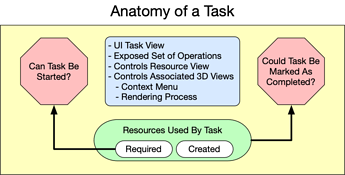
Possible Task Conceptual Model
The figure above shows a possible structure for a Task. At the core of the Task is a set resources. Some of these resources are given to the Task in order to satisfy its requirements. A Task can only be performed by the user iff its starting requirements are met. Similarly, a Task also has a completion condition which can also be driven by its resources though we may want to expand it to include things like Has operation X been run successfully? . Unlike the starting conditions which always indicates if the Task can be started or not, the completion condition does not always indicates that the user is done with the Task. Instead it indicates that the user has satisfied enough of the Task such that it could be marked as completed.
These conditions would be represented by C++/Python functions that take in the Task, though we probably could support a declarative approach (at least of the starting requirements, similar to how an operation works).
Other parts of a Task would include:
- Task View - an UI representation associated with the Task, similar in concept to the Attribute Views, though they would not be limited to only working attribute resources.
- Set of Operations - tools needed for the user to manipulate the Task’s resources in order to complete the Task
- Resource View Requirements - one of the main changes to the CMB ModelBuilder Architecture is to make the Resource View and a subset of the 3D windows, slaves to the Task being performed, instead of being independent UI constructs. As Task would be able to determine what should be initially displayed in the Resource View (perhaps even having its own Descriptive Phrase though that might be reaching a bit).
- 3D Window Control - similar to the Resource View Requirements, a Task should be able to influence how the geometric and mesh resources are rendered (perhaps by having its own representation?). In addition, the 3D context menu should be modifiable by the Task to allow task specific interactions within the 3D window.
- Selection Control - a Task should be able to set (by default?) what the selection mode should be.
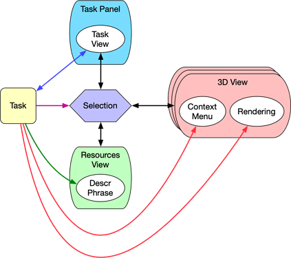
Below shows a possible Task control diagram.
Couple of things to note:
Selection Unity
Selection is now unified meaning that there is no longer the question, if the user selects a model component in the resource view, does it effect the selection in the attribute view? The answer is yes. There is one selection state unified under the Task.
There is an open question concerning what if the user wants to select something that is not required by the Task? For example, the user is assigning boundary conditions but wants to display a volume for reference. The user could change the selection filter, but this will result in things getting into the Selection that would be rejected by the Task.
One possible approach would be to have the ability for the Task to ask the Selection to only return the set of Persistent Objects that matches a criteria. This could also be used to indicate during the selection process what the user has selected is appropriate for the Task at hand.
Dealing with Multiple 3D Views
Due to the underlying ParaView architecture, ModelBuilder can have an “unlimited” number of 3D Views. To deal with this, I would propose that we can “link” a Task with a 3D View and when the user switches to a different Task, the current active View will automatically switch to that Task as well.
Task or Task View
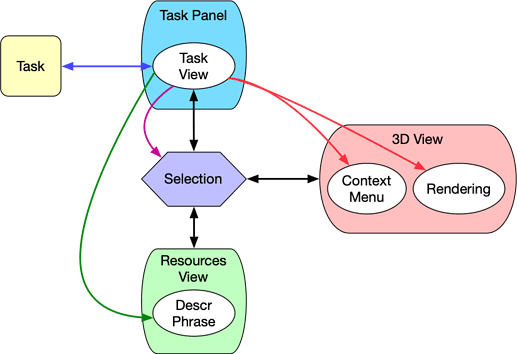
The above figure has the Task doing most of the work, though we could instead put most of the functionality into Task View itself as shown below.
In this case, the Task would only know about the Task View, while the Task View would deal with the majority of the UI interactions.
Relating Tasks with Current Views
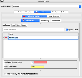
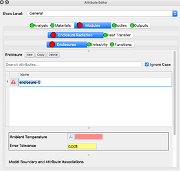
In many ways we have already implemented some of the key features of tasks. Mainly the ability to tell the user if they have work to do in a current View or if they have sufficiently filled in enough information as shown below.
Here you can see the user still has work todo in the Modules Tab with respects to Enclosure Radiation Enclosures.Lets assume for a moment that each Group View (represented by each Tab Level) represented a Parallel Task View (a group of tasks that could be performed in any order). Therefore each Tab would represent a Task. Lets also imagine for a movement we expand the idea of marking Tabs with icons. For example, we could do the following:
- Ready to be Performed - red
- Ready to be Marked Completed - green
- Marked Completed - blue
In addition we could disable the Tab if the Task is not ready to be performed. Here is a possible rendering of what the above could look like if it was a set of tasks.
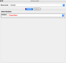
If the top was a serial task group instead then the initial workflow could look like this.
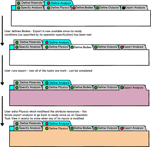
Here the user must choose complete specifying the analysis before the user is allowed to continue.Here is a possible workflow that explicitly includes exporting the analysis as a task.
In this mockup, the export task is initially marked not ready to run (using a black marker in this example). When the attribute resource is properly filled out, the export task goes to ready. When it is run then the top level group task of defining an analysis is marked as can be completed. If later, the user changes the attribute resource then the export task flips back to ready to run.
Ideas on the 3D View Side of Things
Within CMB, perhaps the 3D windows could have a Contents decoration and/or Context Menu entry that would allow the user to choose which Task is being displayed in the View?
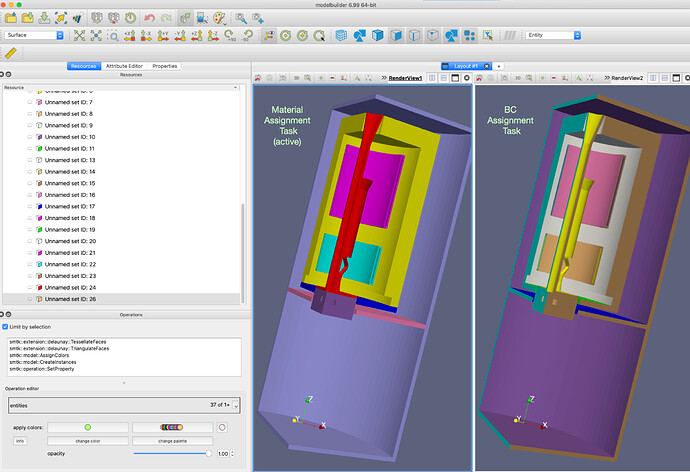
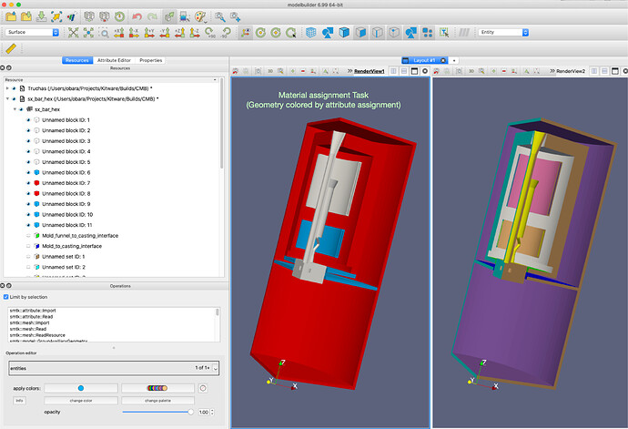
For example, assume we have 2 Tasks: one to assign boundary conditions; another to assign material properties. ModelBuilder (using Tasks) could look like this:
The left 3D view is associated with the assign material task and is displaying volumes while the right side (associated with the assign boundary conditions task) is displaying surfaces.
I want to take this even further so that the tasks can influence how the model gets rendered as shown below:
Here the view for material assignment is color coded, where blue could indicate the volumes where the current material is assigned, red indicating where another material has been assigned, and white where no material is currently assigned.
