Current Implementation
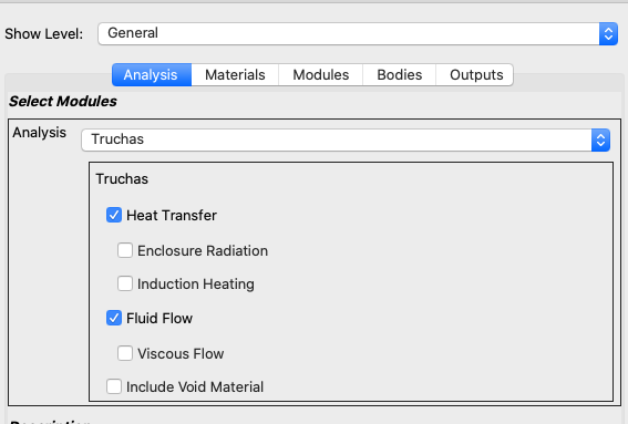
The current implementation used a QGroupBox as the main widget. Though this made the UI design simple to implement based on the following:
- Automatically provided the main Frame
- Automatically provide checkbox capability for Optional GroupItems
- Provide a grouping look and feel by having a border and “sunken” look around the box’s contents
It also had some drawbacks:
- In the case of an optional GroupItem, the border would still be present making things look a bit odd
- The text for the GroupItem label was smaller than the rest of the text
- There was no way of displaying status, etc… in the QGroupBox title (it was strictly text only).
New Design
The new design is more custom and uses a combination of Frames and Layouts:
- Main Frame - holds everything (main widget)
- Title Frame
- Optional Checkbox (for optional GroupItems)
- Title Label
- Alert Label - indicating a GroupItem’s conditional requirements have not be met
- Contents Frame - holds contents of the GroupItem
- ButtonsFrame - for extensible GroupItems
- ChildrensFrame - for the GroupItem’s subgroups and children items
- Title Frame
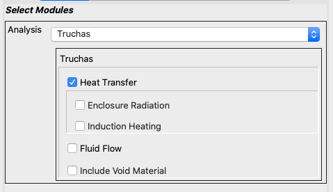
Here is an example of the new UI:

Notice that Heat Transfer is a group that contains Enclosure Radiation, and Induction Heating (indicated by being slightly indented)
Possible ItemView Options
Indentation Control
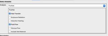
Example of 0 indent:
Frame Control
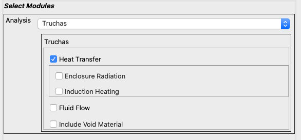
Here is a case with the contents frame with a sunken shadow:

Or using the Look and Feel of the current Windowing system but with a plain shadow.

Comments?
