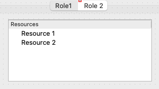
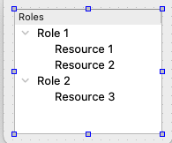
In the process of designing a User Interface for the Gather Resources Task and there are a couple of architectural issues. The main one is how to display the UI needed to aid the user in selecting Resources from the Project that will be propagated (via adaptors connected to the Gather Resources Task) to the rest of the workflow.
There are 3 possible approaches:
Repurposing the “Attribute Editing Panel”
Currently the attribute editing panel observers the Operation, Task, and Selection Managers to see if an Attribute Resource has been given “focus”. For example, making a Fill Out Attribute Task Active or selecting an Attribute Resource from the Resource Browser will display an appropriate View in the Attribute Editing Panel. We could expand the role of this panel to include displaying a Task’s UI (driven by its View Configuration).
Using the Resource Browser
Another approach would be define a custom Descriptive Phrase Model associated with the Task and have the Resource Browser visualize it. In this case we could have the “top nodes” in the model correspond to the “roles” defined in the Task’s configuration. Special badges could be used to indicate if a role’s requirements have been met as well as indicating which resources have been associated to a specific roles (and if that association is exclusive). This may be the most flexible of the approaches but also potentially the most complex to implement.
Presenting a Pop-Up Dialog in the Diagram Panel
In this case a modal UI Dialog (probably similar to what would be presented in the first option (though not necessarily View driven) would be presented on top of the diagram panel (similar to how rename currently works). This could introduce some UI limitations since it would cover the diagram panel’s contents.

