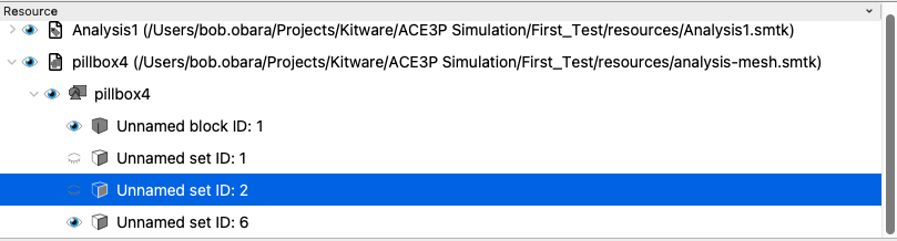
Here you see that some of the geometry for the pillbox4 model has been hidden . Unfortunately the current approach only uses a binary visibility badge so a parent is always shown as visible even if all of its children are invisible. The converse is also true. If you switch off a parent node (which makes all of its children invisible) and then make one of its children visible, the parent is still shown as invisible.
In addition, a node in the tree could contain children as well as its own geometry. In the current design, the only way to turn off its geometry is to make the node invisible which will also turn off all of its children.
In order to address part of the problem, we need to introduce a tristate visibility setting perhaps a greyed out eye to indicate that the node has some of its children visible and some that are not.
In order to better support node that can contain geometry and children, there are 3 possible options to improve the situation.
Option 1: Create 2 Visibility Badges
In this option we would have 2 visibility badges:
One Badge to control the node’s geometry visibility (Bi-State)
One Badge to control the visibility of the node’s children (Tri-State
For example the visibility badge for children could be a different color or have something added to differentiate it from the geometry visibility such as this:
In this approach we would have the following behavior:
Changing a node’s geometry visibility will effect the children visibility badges of its ancestors
Changing a node’s children visibility will propagate its visibility down to its children setting both a child’s geometry and children visibility badges to the new value (note that a child may not have both badges). It also will propagate up its visibility changes to its ancestor to set their children visibility badges.
Option 2: Make the Visibility Badge Hex-State
In this case we would combine the two badges above into 1 that would have the following possible states:
Geometry Visible, Children Visible
Geometry Visible, Children Invisible
Geometry Invisible, Children Visible
Geometry Invisible, Children Invisible
Geometry Visible, Children Partially Visible
Geometry Invisible, Children Partially Visible
The User would only be able to set the first 4 states (2 if the node only has children or geometry). If there are 4 options we would need to use a pull down while the 2 option cases could use a simple mouse click.
Option 3: Split Nodes that Contain Both Children and Geometry
In this approach, an additional descriptive phrase would be created to represent a parent node that has its own geometry and would be placed under that node.
The behavior would be relatively simple:
Changing a node’s visibility would be propagated down to its descendants and its ancestors would have their visibility recalculated.
Pros and Cons
Approach 1
Pros
Would clearing indicate which visibility the user is setting.
Cons
Need to create icons that make sense
Nodes could have different number of badges and different types of badges for visibility
Approach 2
Pros
Each node would only have 1 Badge
Cons
Some badges have a pull down while others are clickable could be really confusing
Trying to come up with 6 icons to represent the 6 states could be challenging
Approach 3
Pros
One Badge that has the same user behavior it has today though it would be tr-stated.
Cons
This will require some potential retooling of the Descriptive Phrase Generator stuff
In my opinion, option 1 is the winner. The cons are minimal (we have folks to help with the icon design and I don’t think it would be hard, and I consider the different number/type of badges helpful rather than a hindrance – since they tell you where the geometry is as well as provide control over it). The benefits are improved usability and an easy implementation as well as the clear indication mentioned above.
As an example, I think this icon: (unicode 0xf0e8) would make a good control for child visibilitites. The bottom 3 nodes could be filled totally, partially, or empty depending on whether the children were visible, partially visible, or totally hidden. It is distinct from the eyeball / (unicode 0xf06e/0xf070), which would only appear for items that have their own geometry and only have 2 states.
(Revised) My first inclination was option 3, with separate list items for geometry and components; reasoning was mostly for clarity to users. But on further reflection that would essentially double the vertical space needed for each component, which seems terribly inefficient. If we can come up with some intuitive icons, I’ll change my vote to #1.
Option 1 has a complex icon, that when displayed at size of use might be almost unreadable. There is also a question of how to edit these two, unrelated states. David addressed this second problem with the idea of using two checkboxes. However, this adds a point of complexity that can be a source of initial confusion and would require some amount of explanation. It also add visual clutter.
The single “con” listed above could be negated by simply always calling the item something along the line of “self geometry”. It should always be the first items in the child list, and can be further highlighted as different from the other children through either bolding, or different font color, or bounding the name with special symbols like *self geometry* (or something along those lines).
I would claim that listing the “self geometry” as a child would also be essentially self-documenting, and would be more intuitive for the user.
Use cases:
Item has no children, and no intrinsic geometry —> no checkbox
Item has no children, but does have intrinsic geometry —> binary checkbox
Item has children, but no intrinsic geometry —> trinary checkbox, but no child “self geometry” OR “self geometry” is listed as a child but grayed out
Item has children, and intrinsic geometry —> trinary checkbox, and “self geometry” listed as a child with a binary checkbox
I’m definitely with Stan on this one. Another option or highlighting self geometry would be to apply a unique icon before the self geometry title. Each item in the list already has a type-indicating icon directly following the eye button, so this would not add any extra clutter.
A side note: I think we should update the eye icon for a couple reasons. First, to my subjective mind, it looks a little dated. Second, making it a blue eye doesn’t really make it more readable and it has a vague racial bias that is definitely too easy to fix to not do something about.
This icon is inherited from ParaView, so this comment may be better elevated to that community.
Actually it would only add a new line for any component that has children and geometry. If it has only one or the other than there would be no extra entry. So if your resource contains Components that either have children components or geometry, there would be no change from what you see today - except that the visibility badges for those components that have children would be trinary.