In a recent meeting, we discussed how large templates that include many nested items can end up taking a lot of space. I’m starting this thread in the hopes of spurring some discussion on possible alternatives.
The idea I had was to see how easy it would be to port something like iOS table widgets to Qt (or whatever we target):
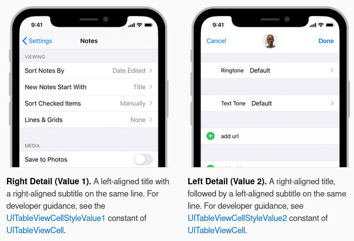
(taken from the iOS documentation). The things I like about this approach are
- The arrows at the right of each row allow editing details without them taking up space all the time.
- The “detail” shows a brief summary of what can be edited by tapping/clicking on the right side of the row.
- When editing a detail, the parent items are not shown so parents and children do not compete for space. (The “back” arrow at the top left allows navigation up to parents. Bread crumbs that show multiple parents are also possible).
- (not shown) I believe it is possible to include toggle switches in rows that also have an arrow to allow detail editing, so one might enable an option and then edit details.
Some other options to accommodate complex templates might include:
- A search field that eliminated UI elements except for those which matched
- An adaptive/responsive view that changed its layout when it is given (or it loses) the focus. This has been used a lot lately by web browsers to hide tabs and menu items so more page content can be shown.