UI (view) for GatherResources task

I’ve got a couple candidate mockups for the GatherResource task UI, and would appreciate opinions/feedback on preference for either option, suggested changes, or alternative designs. I’m currently leaning toward the second option (single column).
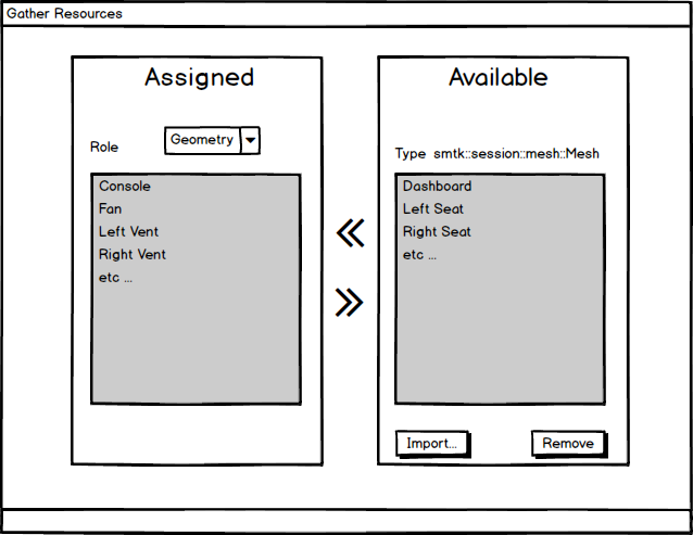
Two Column View

Mimics the look of the two-column attribute association widget.

  • The “Assigned” panel on the left lists the resources assigned to the role selected in the combo box above the list.
  • The “Available” panel on the right lists the unassigned resources matching the type specified for the currently selected role.
  • Below the “Available” list are buttons to import resources from the file system and remove them from the unassigned list.
  • The left arrow is disabled when the “Assigned” list has reached the max for that role.
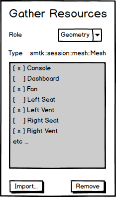
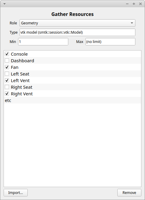
Gather Resource

One Column View

A version using less horizontal space could put all of the resources in a single list with a checkbox next to each item indicating assignment to the currently-selected role.

  • The combo box for the role might also include “all” and “unassigned” options for convenience (maybe both views should). When either of those are selected the checkboxes are disabled.

Gather Resource 1 Column

FYI: @Bob_Obara @dcthomp @aron.helser @justin.2.wilson @rohith @Aaron

@johnt The prototypes look good but

  1. I might add a search bar to either/both prototypes.
  2. Neither prototype tells the user how many resource(s) to select in a given role (or how many more are required, etc.).
  3. Instead of fixed “Import” and “Remove” buttons, you might have the smtk::view::Configuration object accept something to specify actions so that applications can provide their own buttons (e.g., the wind-tunnel might provide “Create an enclosure”). This would require some logic to allow plugins to register button-like actions.

A couple questions about where this new view fits in smtk:

  • Should this UI element be a subclass of smtk::extension::qtBaseView?
  • Does this view belong in a different/new dock widget? Is it time to implement a dock widget for the active task’s UI?

A bit more:

  • I’ll paste a first UI prototype below (generated by Qt Designer). Not very aesthetic but I’m hoping it’s good enough for our initial functionality.
  • Given the short timeframe (this week), optional features like highlighting, sorting, search box, and customized buttons are deferred to future updates.

@johnt That looks like a start, though if the fields aren’t editable (like Type, Min, and Max), they should probably be labels.