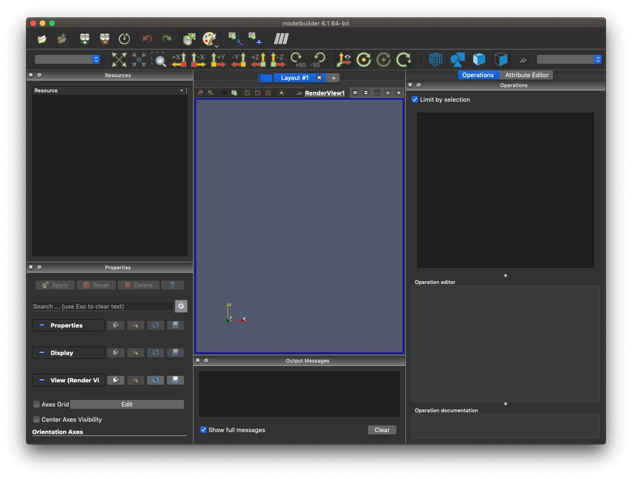
We are currently working on updating the ModelBuilder documentation. As part of this process, I am looking for input on the default layout of ModelBuilder.
Here is one suggestions I have received so far:
I’d appreciate any suggestions or comments.
We are currently working on updating the ModelBuilder documentation. As part of this process, I am looking for input on the default layout of ModelBuilder.
Here is one suggestions I have received so far:
I’d appreciate any suggestions or comments.
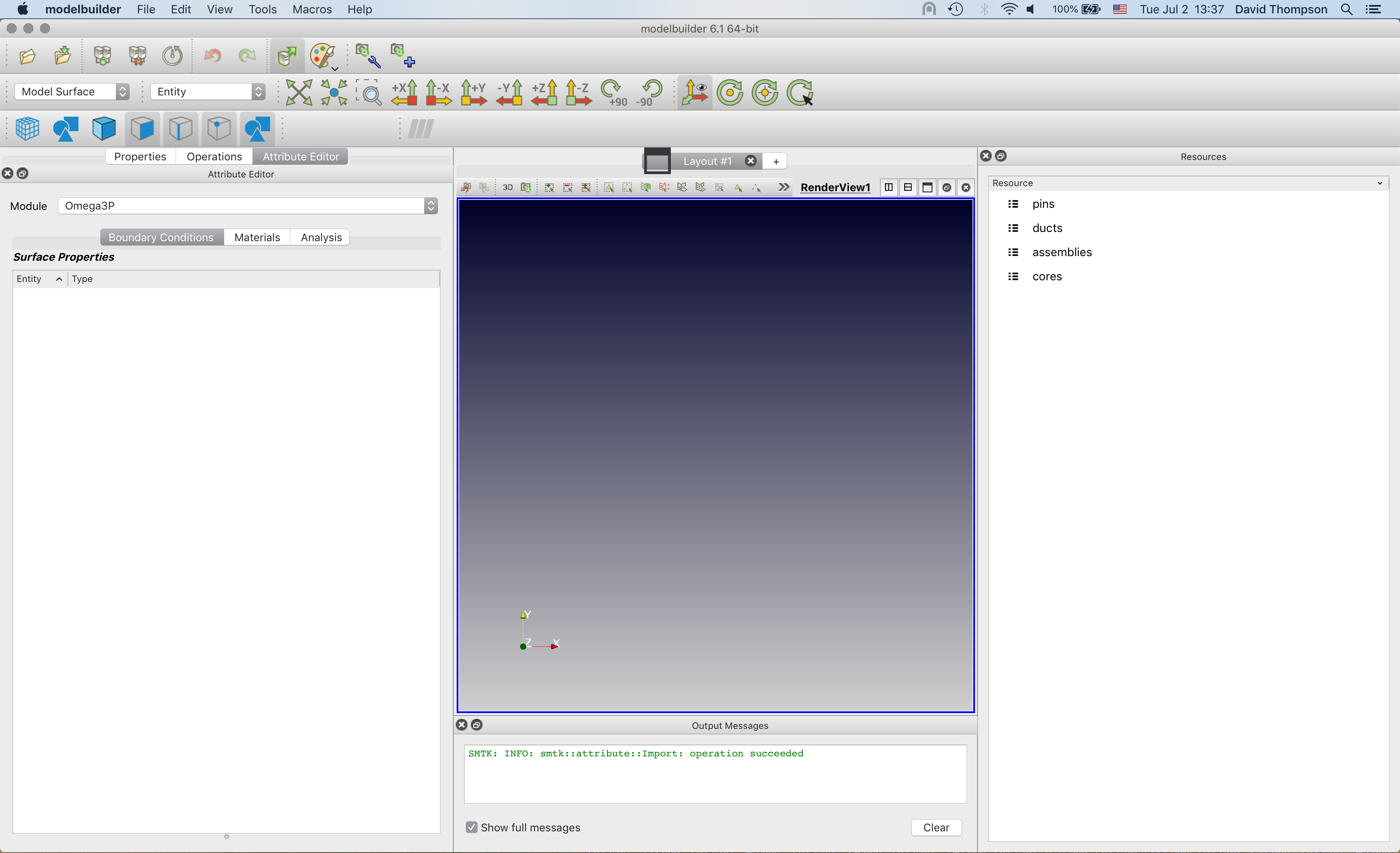
I thought I would resurrect this topic now that we are loading ALOT of panels by default, and the first-time user can be pretty overwhelmed. I am proposing a layout nearly the same as David’s; the one difference is that I put the Attribute Editor and Resource panels in a tab widget:
looks awesome, I agree there are too many panels opened by default.
The issue I have with the resource panel and attribute editor being tabbed together is that the resource panel can typically be narrow while the attribute editor frequently needs to be wide.
If I had my druthers, it would be a view, not a panel.